
Image by Steffen Prößdorf. Source: Wikimedia commons
Introduction
Some European leagues have been touted as ”farmers league” by opposition fans in other leagues because they perceive these leagues as not competitive enough. Competitive in the sense that, they would rather want to witness a competition with three or more teams challenging for the title as opposed to the situation where one team dominates the league. A case in point is the dominance of PSG in the French League 1 over a couple of seasons and probably in the ”German Bundesliga” where the Bavarian giants (Bayern Munich) have dominated the league for nine seasons in a row. One could also point to the Italian ”Serie A” which until the last season (2020/2021) the monopoly of Juventus was broken by Inter Milan. It raises genuine questions regarding the inequalities in these leagues which affects the competitiveness of their respective domestic competition.
In this blog, we will analyze the inequality in the top 20 European leagues by applying statistical approaches to assess the distribution of the strength of the teams in each league. We do this in order to ascertain and compare the degree of inequality in each of the leagues. For instance, we will try to answer interesting questions such as: are the teams in the EPL of fairly equal strength? how does the EPL compare to the German Bundesliga for instance where one team has dominated the league for such a long time. Popular opinion suggests that the EPL is a more competitive league with fairly equal strength of the teams because the winner cannot be predicted with much certainty. As once said by Edward Deming ”In God we trust; all others must provide data”, Hence we seek to use data analytics to discuss the inequalities across the European football continent. Continue with me to the next section to get more insights.
Measures of variability
Before we delve into the rudiments of the inequalities, let us first take a look at the data sets. The data consist of the strength of teams in each league obtained using Glicko2 ratings for the 20 Top-flight leagues in Europe. The Glicko2 is a popular sport rating algorithm used for assessing the strength of players or teams. It follows that a team with a higher Glicko rating index is stronger than a team with lower rating index. Feel free to refer to xxxxx for insights regarding the rating of the top 20 teams in the world. Figure 1 depicts the average strength of the top 20 leagues in Europe.
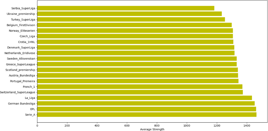
Average league strength across top 20 European leagues
From the figure above we notice that the Italian Serie A, EPL, German Bundesliga, Spanish La Liga and French League 1 comprise the leagues with the highest average strength respectively. It is not surprising that these leagues are in the top 5 ranked in Europe. Conversely, the Serbian Super League, the Ukrainian Premiership, Turkish Superliga, Belgium First Division and Norway Eliteserien are the leagues with the lowest strengths on average respectively. Next, we will explore the inequalities in the leagues considering some statistical measures of variability.
Interquartile range (IQR)
Firstly, using the IQR we will discuss how the strength of the teams is distributed in each league. The IQR is a statistical metric that shows the variability of a distribution around its average value (median specifically). In order words, it tells us the degree of spread of the middle 50% of the dataset. The IQR is advantageous in the sense that it is insensitive to outliers as compared to other measures of variability such as the range and standard deviation.
The next image depicts a box plot of the top 5 leagues which provides some graphical insights regarding the variability of the teams’ strength. We notice that the German Bundesliga and the French League 1 have outliers (specifically Bayern Munchen and PSG respectively). That implies the strength of these two teams far outweighs the average strength of all other teams in the leagues. It can also be observed that Serie A, EPL and Spanish La Liga are positively skewed from their 50% percentile or median (yellow line) with high whiskers indicating that there is more variability between the median and the top teams. Comparatively, with the exception of the outliers, the Bundesliga and the French League 1 have fairly normal distribution as can be seen from the box and whiskers plot.
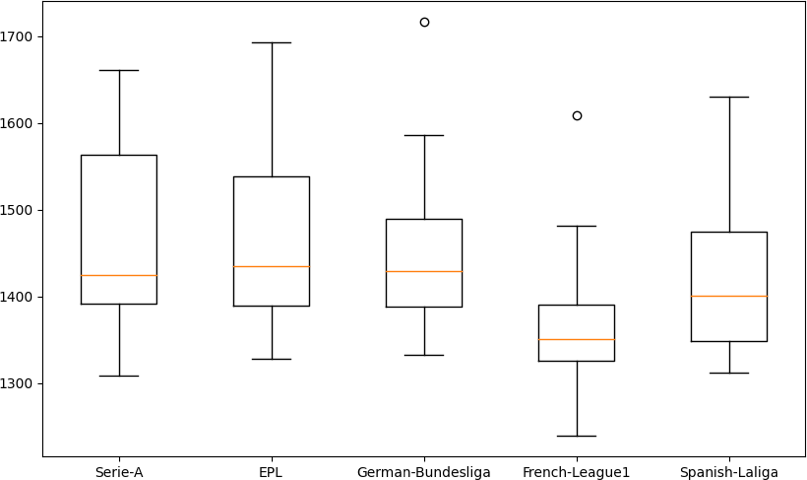
Team strength – Top 5 European leagues
The table below presents the inequality score based on the IQR. The IQR is a measure of the variability based on splitting the data into quartiles and obtaining the difference between the third quartile and the first quartile. Hence we are able to obtain the variability around the middle 50% of the datasets. The second column shows the IQR for all the leagues whilst the third, fourth and fifth columns depict the percentiles of league strength (Glicko score) for each league.
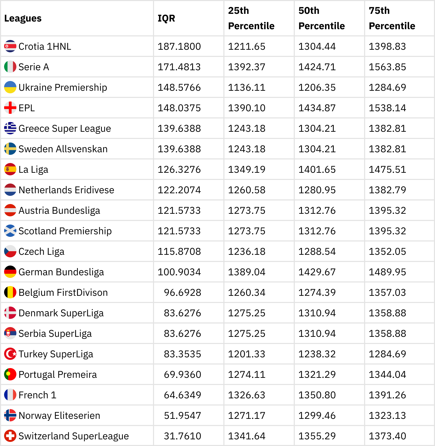
Inequality score based on IQR
It can be noticed from the table that the Croatian 1 HNL, the Serie A, Ukraine Premiership, EPL and the Greek Superliga make up the top leagues with the highest IQR. This is not surprising because of the big difference between the 25th percentile and the 75 percentile indicating a wider gap between the top and bottom clubs. Hence inequality or variability exists in the these leagues. The Swiss Superliga has the least IQR implying that it is the league with the least inequality and therefore the most competitive league among the 20. The Norwegian Eliteserien, French League 1 and the Portuguese Primeira also have low variability in terms of distribution of the strength of teams in the leagues. Considering the top 5 European leagues, Serie A, EPL and La Liga have higher in- equalities (due to higher IQR) as compared to the German Bundesliga and French League 1 Are the results surprising? Follow to the next subsection as we consider another alternative measure of inequality.
Gini index
The second approach, the Gini index, is popular particularly in economics where it has been applied to assess the distribution of income across countries. It measures how far the distribution of a variable deviates from a totally equal distribution in a population. The Gini index ranges between 0 and 1, where values closer to 1 indicates greater inequality implying a higher gap between stronger teams compared to weaker teams. Conversely, indices closer to 0 are associated with low inequality implying that there is not much difference between the ratings of stronger and weaker teams. The Gini index is calculated as half of the relative absolute mean difference which is usually defined in terms of the Lorenzo curve 1. The Gini coefficient is therefore equivalent to the difference between the line of equality (assuming the strengths of teams are equal) and the area below the Lorenzo curve all divided by the area below the line of perfect equality.
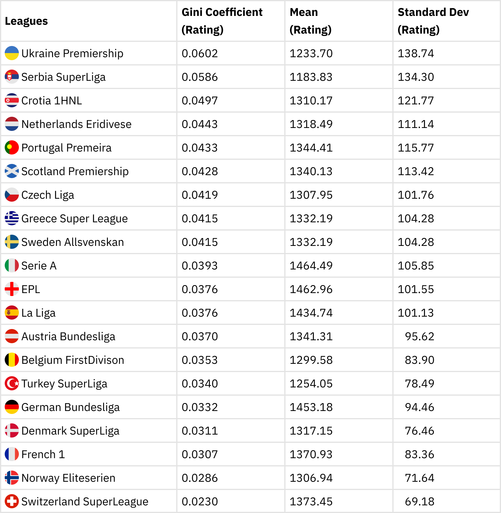
Our second table shows the top 20 leagues in Europe and their respective Gini coefficient in descending order. Column 3 shows the mean strength of the teams whilst column 4 shows the standard deviation.
Inequality score based on Gini index
It can be observed that Ukrainian Premiership has the highest Gini index corresponding to the highest league inequality followed by Serbian Superliga, Croatian 1 HNL, Netherland’s Eredivisie, Scottish Premiership, Czech Liga, Portuguese Primeira and Greek Superliga in that order. Overall the Swiss Super Liga has the least inequality in terms of the Gini coefficient. There is some correlation between the standard deviation and the Gini coefficient as can be seen from the table above. Nevertheless, the standard deviation suffers from outlier problems hence it makes it unsuitable for measuring variability. The Gini index, therefore is a more preferable measure of variability. Secondly, results from the Gini inequality index (second table) are not very different from the IQR (first table). So we can infer that our inequality measure is consistent and robust.
Among the top 5 leagues, the Italian Serie A has the most inequality, followed by the Spanish La Liga and the EPL. The French Ligue 1 and the Bundesliga have less inequality comparatively and can be considered as the most competitive top-flight leagues according to the Gini index. At first sight, this is surprising given the fact that PSG has dominated the league for some time until recently when OSC Lille won the 2020/2021 Championship. Nevertheless, it is feasible to note that, once PSG is excluded from League 1, all the other 19 teams are fairly of equal strength. The same can also be said of the Bundesliga; once Bayern is excluded from the league, all the other teams are fairly of the same strength. The box plot in figure 2 also confirms that the French League 1 and the Bundesliga teams have a fairly normal distribution with the exclusion of the outliers.
Conclusion
In this blog, we have used two metrics to assess and compare the distribution of strength of teams in top-flight European leagues. The aim is to understand the competitiveness of the leagues by way of measuring the inequalities in the leagues. There is a popular opinion regarding the competitiveness of certain top-flight leagues in Europe due to the dominance of specific teams over a couple of seasons. The EPL has been touted by many as the most competitive in terms of equal strength of the leagues whilst the French League 1 has been dubbed a ”farmer’s league” due to PSG’s dominance and perceived lack of competition. We have investigated the inequalities in the leagues using the IQR and the Gini coefficients which are both popular measures of inequality in statistics and economics.
Our results reveal that among the 5 top-flight European leagues, the Italian Serie A is the most unequal league followed by the EPL and Spanish La Liga. Even though the French League 1 and the Bundesliga have dominating teams, the strength of the teams is evenly distributed as compared to the other top-flight leagues. We can see that dominance by one team does not necessarily imply a lack of competitiveness in the league. Overall, the Swiss Super league was found to be the most competitive league in Europe.
Insights
The above results and discussion can be beneficial to sport stakeholders in threefold; Firstly, it would be useful for the evaluation of potential signings with limited playing time as sample size. When scouting players from leagues with low inequality, fewer minutes of playing time should be needed to reliably understand their performance levels, given the competition. With higher inequality and a more diverse spread of opposition level, players require a much closer look at what fixtures they have actually played in and if that suffices for a representative picture to assess their performance level within that competition.
Secondly, this information will be useful for gradual development and progress of young players. For instance playing in a low inequality league such as the Swiss, Norwegian or even French League 1 would afford young players the opportunity to play against opponents of equal and consistent strength. On a contrary, fielding a young player in a league with high strength inequality could stifle their development due to a potential high variability in the strength of their opponents. This information would prove useful for head of player development who may want to loan out their young players.
Finally, it could be very interesting to scout in high-level, high-inequality leagues where a player from a low-level team performs exceedingly well against high-level opposition. Therefore knowledge of a league’s inequality could be beneficial for scouting purposes.
Key Points
- Dominance by one team in a league does not necessarily imply a lack of competi-
- Among the 5 top-flight European leagues, the Italian Serie A is the league with the most inequality in terms of team strengths followed by the EPL and Spanish La
- Even though the French league 1 and the Bundesliga have dominating teams, the strength of the teams is evenly distributed as compared to the other Top-flight
- The Swiss Super league was found to be the most competitive league among the top 20. Conversely the the Ukranian Premiership and the Croatia 1NLH are the leagues with the most inequality in terms of team’s
1Graphically, the Lorenzo curve depicts the distribution of a variable by plotting the percentile of the variable and the cumulative distribution on the vertical axis

